
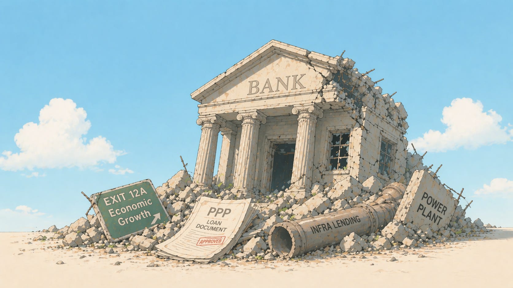
What really broke India's banks in 2010s
Hint: it wasn’t just bad lending

Our goal with The Daily Brief is to simplify the biggest stories in the Indian markets and help you understand what they mean. We won’t just tell you what happened, we’ll tell you why and how too. We do this show in both formats: video and audio. This piece curates the stories that we talk about.
You can listen to the podcast on Spotify, Apple Podcasts, or wherever you get your podcasts and watch the videos on YouTube. You can also watch The Daily Brief in Hindi.
In today’s edition of The Daily Brief:
What really broke India’s banks in the 2010s
India’s economy might have a productivity problem
What really broke India’s banks in the 2010s
Between FY11 and FY18, gross non-performing assets — loans that borrowers had stopped repaying — at India’s public sector banks (PSBs) went from 2.4% to 14.6% of total advances. At private banks, they barely moved over the same period, from 2.5% to 4.7%. The standard – albeit a lazy – understanding of this gap has been that PSBs were worse at lending. Worse governance, weaker underwriting and softer monitoring caused this. The numbers just confirm what everyone already suspected.
A recent CSEP working paper by Rakesh Mohan and Divya Srinivasan pushes back on that reading. Their argument is that the crisis wasn’t primarily about bad lending. It was the predictable outcome of a policy architecture that made PSBs the only available channel for financing India’s infrastructure build-out, and then pushed enormous volumes of credit through that channel into sectors that were structurally fragile. When those sectors broke down, the losses came back to the banks. When the banks needed rescuing, the government paid the bill.
The crisis was baked into the design before anyone wrote a bad loan. That’s an interesting take, and here’s how we understand it.
A critical piece, missing
India has built a respectable architecture for long-term project finance after independence. Development Finance Institutions (DFIs) like ICICI in 1955, IDBI in 1964, then PFC, REC, and IRFC through the 1980s were set up specifically to lend for 20 and 30-year projects.
Now, commercial banks couldn’t do this because they fund themselves with short-term deposits like savings accounts or FDs. Lending 25 years against that builds up a serious maturity mismatch. Basically you are getting (borrowing) money for a short time, but giving (lending) for super long periods.
DFIs sidestepped this by raising money differently. They didn’t compete with banks for retail deposits. Instead, they issued long-dated government-guaranteed bonds, received concessional funding lines from the RBI and multilateral lenders like the World Bank. They also developed specialised expertise in evaluating project lending risk, which a general-purpose commercial bank doesn’t naturally build.
However, the 1991 reforms dismantled this model. Concessional funding was now withdrawn and DFIs were asked to raise money from markets at commercial rates and they were pushed to convert into banks. By the early 2000s, ICICI and IDBI themselves had become commercial banks.
So if DFIs didn’t exist anymore, what was supposed to fill in the gap of long term funding? The expectation was the bond market, but it barely did. In 2008, corporate bonds were just 4% of India’s bond market, compared to 62% in Korea. Even today, the corporate bond market is only 16% of GDP, and roughly 95% of issuances are rated A or above, which structurally makes it impossible for risky infra projects to ever get funding.
Moreso, the pension and insurance investors who buy long-duration infrastructure debt elsewhere in the world remain thin in India, partly because only 12% of the workforce has any retirement coverage. With DFIs gone and bond markets shallow, banks were the only source of infrastructure debt in town.
How PSBs got drafted into the PPP bet
The 1996 India Infrastructure Report projected that infrastructure investment needs would rise massively over the coming decade. The government didn’t have that kind of money. Tax revenues were limited, fiscal deficits were a standing concern, and competing demands from defence, subsidies, social programmes were enormous. Something had to give.
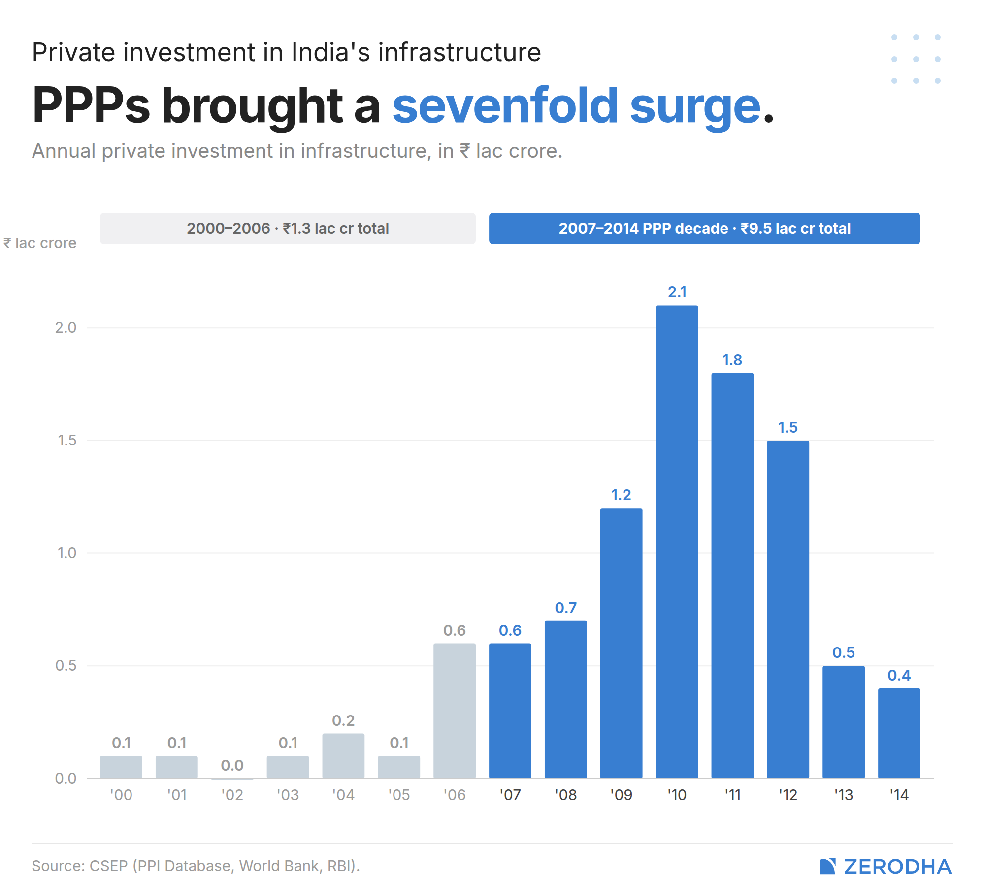
The government’s fix for its infrastructure gap was Public-Private Partnerships (PPPs). The pitch was simple: let private companies build and operate infrastructure, bringing in their own capital and their own efficiency. The government’s fiscal burden, meanwhile, would ease. The Tenth and Eleventh Five-Year Plans set escalating PPP targets.
Private infrastructure investment exploded from Rs 1.3 lac crore cumulative over 2000-2006 to Rs 9.5 lac crore over 2007-2014 — a seven-fold surge.
Now, PPP projects are typically financed 70:30 debt-to-equity. The 30% equity is genuinely private money. The 70% debt had to come from somewhere. With DFIs gone and the bond market absent, that somewhere was commercial banks and overwhelmingly, PSBs.
The RBI, meanwhile, made this only easier. There are limits on how much exposure a bank can have to a borrower or a group. But for infrastructure, the RBI relaxed those exposure limits, giving more headroom. From December 2007, banks could even invest in infrastructure bonds with no credit rating. PPP debt was reclassified as secured in 2013. None of these was individually dramatic, but together they amounted to systematically clearing the path for concentrated infrastructure credit.
As a result, bank credit to infrastructure went from ₹1.4 lakh crore in 2007 to ₹7.3 lakh crore in 2013. Infrastructure’s share of non-food credit rose from 3.6% to 15%. Of that, 70% went to power and roads alone.
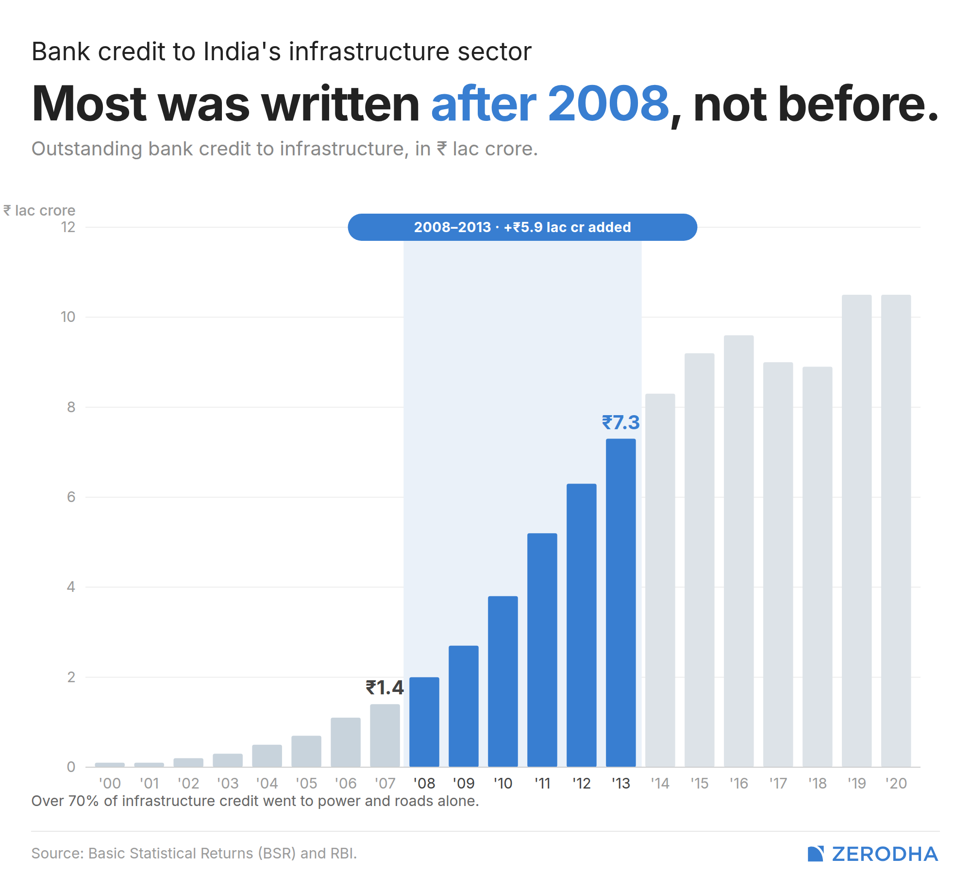
The standard narrative blames the 2003-2008 credit boom. However, while infrastructure credit grew very fast in 2001-2008, that was only on a tiny base. Between 2008-2013 the growth rate was still high at 29%, but on a base that was already seven times larger. Most of the lending that later turned bad was written after 2008, not during the pre-crisis boom. This means it wasn’t a hangover from easy-money exuberance but actually a direct response to deliberate post-crisis policy.
Both public and private banks started at ~8% exposure to the construction sector around 2010. By 2015, PSBs had climbed to 11% while private banks stayed flat. PSBs carried the policy burden because PSBs are how public policy travels through India’s banking system.
Why the “bad lending” story doesn’t survive the evidence
The simplest version of the NPA story — “PSBs lent carelessly to weaker borrowers” — runs into a wall when you look at the actual lending decisions. The authors looked at borrowing companies’ financial data, and compared firms where PSBs were the lead bankers against firms where private banks were the leads. The result cuts directly against the standard narrative.
Before loans were made, firms that borrowed from PSBs had healthier debt-to-equity ratios than firms borrowing from private banks. PSBs weren’t picking worse borrowers. After lending, though, the picture reverses — PSB-backed firms’ leverage climbed faster, and their net profit margins (which had been higher pre-lending) collapsed.
What happened in between?
Two things, partially overlapping. First, once PSBs were committed, they struggled to exit.
You see, infrastructure loans aren’t standalone transactions like a home loan. Typically, they’re arrangements where a consortium of multiple banks lends together and disburses in tranches as the project hits construction milestones. Once you’ve put money in for the first tranche and the project is half-built, walking away from the second tranche means writing off what you’ve already lent and potentially triggering the collapse of the whole project. You’ve locked yourself into the project.
Once PSBs committed, they kept lending even as borrowers deteriorated. That looks like poor monitoring — and in some cases it was — but in many cases it was rational behaviour, given sunk costs.
Secondly, the sectors these loans went into broke down in ways that would have sunk even financially sound borrowers.
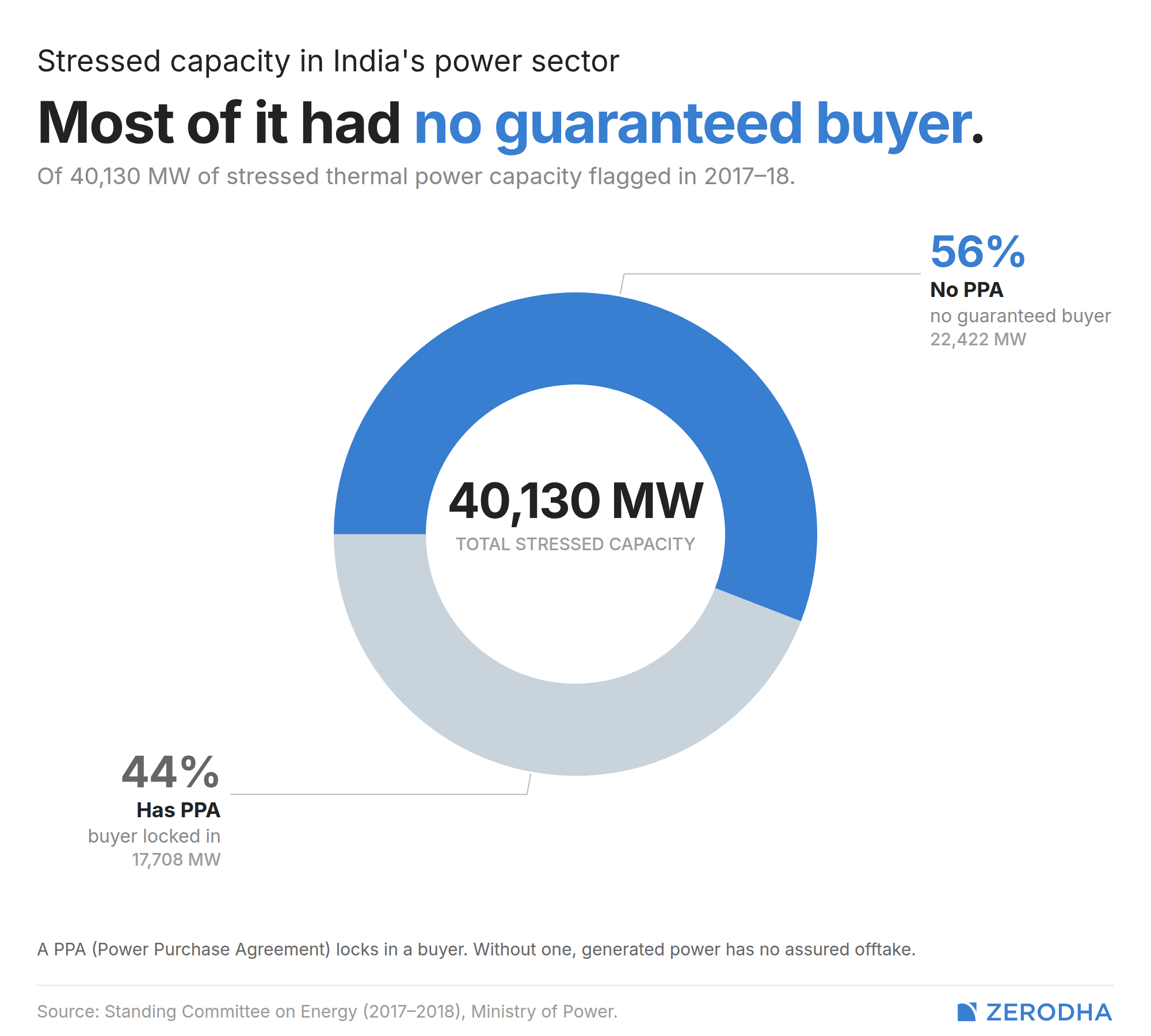
Take, for instance, the power sector. India went from a state of under capacity to overcapacity, all on the back of wildly optimistic estimates of demand. Coal supply also got disrupted as over 200 coal block allocations were cancelled, and the shortages caused lost generation of electricity. During the period, 34 stressed coal plants were identified and 56% of that capacity had no Power Purchase Agreement at all — meaning no guaranteed buyer for the electricity produced.
Behind the whole sector sit discoms, the state distribution companies that buy power from generators. DisComs have been structurally broken for decades, for reasons we’ve covered in past stories.
When your buyer can’t pay you reliably, your debt becomes hard to service regardless of how well-run your plant is.
Meanwhile, roads had their own problems. Land acquisition delays affect 80-90% of projects and consume 15-20% of project duration.The road sector’s NPA ratio went from 1.9% in FY13 to 20.3% by September 2017.
This isn’t a uniquely Indian dysfunction. Between 2010 and 2014, nine of ten toll road PPPs around Spain’s capital, Madrid, defaulted after traffic forecasts proved 40-50% too optimistic. Road PPP failures are a recognised international pattern.
The fiscal boomerang
The original pitch for PPPs rested on two claims. The first was efficiency brought in by private companies. The second was the fiscal relief that public finances would receive because of private capital entering in. The efficiency case has mixed but defensible evidence in some sectors. The fiscal case, in the debt-heavy Indian model, turned out to be largely an accounting illusion.
How so? Like we said before, in a PPP project, the 30% equity is the only genuinely new private money entering the system. The 70% debt came from commercial banks, disproportionately PSBs. When that debt went bad, the losses landed on their balance sheets. When those balance sheets got so bad that they couldn’t lend any further, the government had to step in and recapitalise.
Between FY09 and FY22, PSBs received over ₹4 lakh crore in capital infusions — ₹ 1.5 lakh crore from the budget over 2010-2022, and ₹2.8 lakh crore through recapitalisation bonds between 2017-2022.
Now, let’s trace the full circle. The government couldn’t afford to build infrastructure directly, so it created PPPs to bring in private capital. The PPP debt was funded by public sector banks. When projects failed, losses landed on PSB balance sheets. When PSBs needed rescuing, the government paid. In the debt portion of PPP financing, it was essentially funded by Indian savings. What PPPs actually did in this design was reroute public money through banks rather than fund infrastructure directly. The genuinely private contribution was the equity.
What’s changed, and what hasn’t
India is now rebuilding the DFI model it dismantled three decades ago. NIIF was set up in 2015 and NaBFID in 2021. The corporate bond market has grown from 12% of GDP in FY12 to 16% in FY24, but remains dominated by highly-rated corporates that aren’t the ones building greenfield infrastructure. Pension and insurance participation still hasn’t scaled meaningfully.
But, the next generation of infrastructure investment is already in motion through the National Infrastructure Pipeline, and when it hits scale, the financing question will present itself again: are there now institutions that can absorb long-duration project risk, or will the path of least resistance once again run through PSB balance sheets?
The pattern has a way of repeating itself. The microfinance cycle that played out after RBI’s March 2022 interest rate deregulation rhymed with this one — a policy change removed a constraint, lenders expanded aggressively into the new space, stress built up, and cleanup is now underway. Different sector, same shape. Infrastructure lending produced a decade of NPAs. The next cycle, whenever it arrives, will be shaped by how the architecture has changed.
India’s economy might have a productivity problem
In the average Indian household, more people went to work last year than the year before. More earners, longer hours, more members of the family in the labour force. And yet, on average, each of those workers produced less per hour than they did in 2017. While household incomes went up, productivity went down.
A recent paper by Amit Basole and Arjun Jayadev, economists at the Azim Premji University, asks what it means when those two things happen at the same time, and why an economy can look, by almost every headline measure, like it’s doing well, while running a very different story underneath.
Their finding, documented across five datasets, is this: since 2018, India has been growing primarily by deploying more labour, but not by making labour more productive. The number of people working has risen. Household incomes have followed. But output per worker — the thing that actually determines whether an economy is getting more capable over time — has stagnated, and in recent years declined. The gap between those two trajectories is what the paper tries to explain.
We recommend reading this report along with the State of Working India report published by the same institution — we covered the latter as well very recently. The overall picture that gets formed from both is unusual and concerning.
A brief history
To understand how unusual the current period is, it helps to know what came before it.
Between 2003-2017, India’s labour productivity, or output per worker, grew at an average of 6.2% per year, for 15 consecutive years. It was a sustained expansion driven largely by capital-intensive manufacturing and skill-intensive services like IT, finance, and telecoms. Each worker was, on average, producing more, getting more efficient.
Now, these are sectors that certainly produce a great deal of value. But they absorb relatively fewer workers than labor-intensive manufacturing. So while productivity grew strongly, it was mostly concentrated in a section of India’s society.
This hot streak of productivity growth effectively came to an end in 2018. The pandemic made things worse, but it wasn’t the cause. In fact, the paper constructs a counterfactual: what would Indian labour productivity look like today if it had simply continued at its pre-2018 average? It would be 41% higher than it actually is right now. In many ways, 2018 is the turning point of this paper, and we’ll eventually come to how.
The cross-country picture makes this more alarming. Between 2012–2018, India was the top labour productivity performer among large economies globally. But in the 2018–2023 period, it was one of only three large economies where productivity actually declined. In contrast, peers like Vietnam, Indonesia, and Turkey all kept productivity growing through the same period.
Numbers without efficiency
Here’s the central puzzle: if workers are getting less productive, how is the economy still growing?
See, output growth is the sum of two things: productivity growth and employment growth. The same GDP expansion can, therefore, mean very different things. In one version, each worker produces more. In the other, the number of workers rises to compensate for stagnating output per person. And since 2018, India has only been running the second version.
The slowdown in worker productivity isn’t just confined to one corner of the economy. It shows up across manufacturing, services, and construction. Almost everywhere, employment has been growing faster than output.
What’s more, the authors find that India is an outlier in this regard.
How so? Usually, in large economies, the gross value added (GVA) per worker and gross value added per capita of population tend to move together. In most developing countries (like Vietnam), GVA per worker comfortably exceeds GVA per capita. Since the 1980s, India has mostly fit this pattern.
However, that changed from 2018 onwards, where growth in GVA per capita actually exceeded growth in GVA per worker. What that means is that our employed workers are producing little, pulling the per worker average down. Meanwhile, GVA per capita held up because a larger section of the population began working, while not necessarily being more productive.
This is reinforced further by what the authors find when they look at what’s actually driving rising household incomes since 2017. The dominant factor, across nearly the entire period, is an increase in the number of earners per household, and not higher pay per hour. In four of five sub-periods since 2017, earnings per person per hour contributed negatively to household income growth. Families are getting by not because anyone is earning more for each hour worked, but because more members are going out to work.
In essence, the lack of productivity is being offset by sheer size. But this kind of growth has a natural ceiling — what if we don’t have enough young people who can go to work? More importantly, it tells you nothing about whether the economy is becoming more efficient or more capable of sustaining higher wages over time.
One might expect this to be a story confined to the informal economy, with the formal modern sector humming along productively. The enterprise data doesn’t support that picture.
Large factories (those with more than 100 workers) had productivity growth of 5.5% per year between 2010 and 2015. In the 2015-to-2023 period, productivity in those same firms fell at 2.16% per year. Employment kept rising; output per worker fell. Even organised, profit-seeking manufacturing managed to hire more people while producing less per person.
The farms are filling up again
The second structurally alarming finding in the paper has to do with agriculture — specifically, how workers move in and out of it.
In any standard account of industrialization, agriculture is the sector workers should be leaving. The classic story of development is one in which subsistence farmers migrate to factories and cities, where they produce more per hour and earn higher wages. India was doing this, slowly, from the early 2000s. Both the absolute level of agricultural employment and its share of the total workforce had been declining for years.
Since 2018, though, that process has reversed. The share of the workforce employed in agriculture has risen. By 2023, in absolute terms, more people worked in Indian agriculture than in 2011. Among all large emerging economies, India is alone in this. Vietnam, Indonesia, Brazil, and Mexico all continued to reduce agricultural employment shares through the same period.
The paper calls this “structural retrogression“, where economic transformation seems to run backwards. The authors find that nearly 90% of the post-2017 collapse is explained by this adverse reallocation of labour, workers moving from higher-productivity sectors into lower-productivity ones. The economy didn’t mostly become less efficient within sectors — it allocated its labour worse across them.
Agriculture is a sector that absorbs anyone willing to show up, regardless of whether an additional worker adds meaningful output. When formal sector employment doesn’t generate enough jobs, surplus labour flows back to the default absorber. It’s not a choice, but rather what happens when there’s nowhere else to go.
The women entering the wrong jobs
The paper also looks into female employment. Female labour force participation in India has risen sharply since 2017 — by more than 17 percentage points for rural women over the period. This has been widely celebrated. More women working is, in most contexts, a straightforward marker of progress. But the story is far more complicated than that.
The new female employment is concentrated almost entirely in agriculture, own-account work, and unpaid family labour in household enterprises. That’s not the same as regular salaried work, not manufacturing, not modern services. The women entering the workforce have overwhelmingly entered it in the same low-productivity sectors where surplus male labour has also been congregating.
The authors believe that this looks more like a distress response than an opportunity response. When male earnings in a household stagnate or fall, additional members enter paid work to stabilise income. The household deploys more labour because it has to, not because better jobs have opened up. The rise in female LFPR, in this reading, is a symptom of the same underlying stress that’s been crowding workers back into agriculture, not a sign that it’s being resolved.
None of this makes the employment less real, or the income less useful. But the headline statistic doesn’t carry the developmental weight it’s usually assumed to carry.
The demographic dividend, and what it requires
What does all of this mean for India’s growth story?
We are entering the peak of its demographic dividend: the period when a large share of the population is of working age, dependency ratios are low, and the potential for productivity-driven growth is at its highest. Every conversation about India’s economic future rests on the assumption that this dividend will be captured — that the young workforce will find productive employment and gradually raise living standards.
The paper doesn’t say that can’t happen, but the findings paint a less likely picture of it taking place as smoothly. When high-productivity sectors can’t absorb labour fast enough and demand growth is weak, the demographic dividend becomes a demographic pressure. Large cohorts of young workers enter the labour market, find formal employment insufficient, and flow into surplus sectors that absorb them without making them more productive. That, of course, is the story of the SWI report we covered recently.
Converting that into something better will require sustained demand growth, coordinated investment, and conditions that make it worthwhile for employers to hire into higher-productivity roles. India’s macroeconomic fundamentals may still be strong. But the quality of growth underneath them has been deteriorating for nearly a decade.
Most developing economies face one of two challenges: productivity growing without enough jobs, or employment expanding into low-productivity work. India has now experienced both, in order, as successive phases of the same underlying problem. The formal sector was always too narrow to absorb the labour supply. When it was expanding fast, the result was jobless growth. When it slowed, surplus labour had nowhere to go but backwards.
The headline numbers will keep appearing. The question the paper raises is what exactly they’re measuring, and for whom.
Tidbits:
Major telcos have made incremental plan tweaks, perhaps before a major tariff hike. Bharti Airtel raised its Rs 859 plan to Rs 899 with OTT bundling, Vodafone Idea increased 5G entry price to Rs 349 in some circles, and Reliance Jio cut its Rs 195 plan validity to 30 days from 90, with analysts expecting 10-15% tariff hikes this year.
Source: ETThe RBI partially rolled back forex restrictions imposed April 1, withdrawing ban on rupee-linked non-deliverable forwards and allowing cancellation/rollover of related-party contracts, while maintaining $100 million cap on open positions, after rupee recovered 2% from record lows.
Source: BloombergApple announced that Tim Cook will transition to executive chairman on September 1, 2026, handing the CEO role to John Ternus, currently the company’s SVP of Hardware Engineering. Ternus joined Apple in 2001 and has overseen the engineering behind every major hardware product line. This ends Cook’s 15-year run that saw Apple become the first-ever trillion-dollar company by market cap.
Source: The Guardian
- This edition of the newsletter was written by Kashish and Manie.
What we’re reading
Our team at Markets is always reading, often much more than what might be considered healthy. So, we thought it would be nice to have an outlet to put out what we’re reading that isn’t part of our normal cycle of content.
So we’re kickstarting “What We’re Reading”, where every weekend, our team outlines the interesting things we’ve read in the past week. This will include articles and even books that really gave us food for thought.

Has the microfinance credit cycle turned?
Has the microfinance credit cycle turned? That’s the question we set out to answer by digging through 144 concalls across 18 companies over eight quarters. Instead of looking at management commentary in isolation, we track how the narrative evolved over time—from peak optimism to a full-blown credit shock, and now signs of recovery. The idea is to connect the dots and understand what really drove the cycle, and more importantly, what the industry looks like on the other side.
Thank you for reading. Do share this with your friends and make them as smart as you are 😉
"How so? Usually, in large economies, the gross value added (GVA) per worker and gross value added per capita of population tend to move together. In most developing countries (like Vietnam), GVA per worker comfortably exceeds GVA per capita. Since the 1980s, India has mostly fit this pattern.
However, that changed from 2018 onwards, where GVA per capita actually exceeded GVA per worker. What that means is that our employed workers are producing little, pulling the per worker average down. Meanwhile, GVA per capita held up because a larger section of the population began working, while not necessarily being more productive."
Quite revealing!
One could say that the mere increase in GVA per capita could be a direct result of fall in GVA per worker because lets say in a household one person's salary is no longer enough, so others have to chip in and do part time work (not high paying but helping meet ends nonetheless).
The deeper point the first story in the article is circling without fully stating:
Private banks behaved rationally as commercial entities and PSBs behaved rationally as policy vehicles. Neither was making purely bad decisions given their respective institutional contexts.
The crisis was the predictable output of using commercial bank balance sheets to pursue policy goals without any mechanism to compensate or protect those balance sheets from the policy risk they were absorbing.
Private banks opted out of that burden when they could. PSBs couldn't opt out because opting out "was" the policy (the PPP policy) failure.